
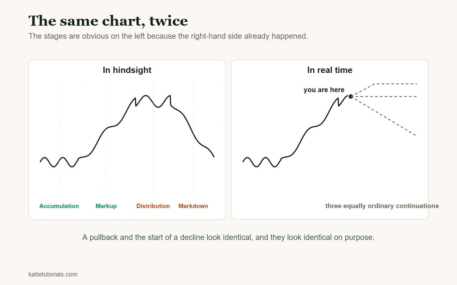
You have seen the diagram. A smooth wave divided into four labelled stages, with arrows showing exactly where to buy and where to sell. It appears in every article on this subject and it is the most misleading picture in trading education.
Not because the stages are wrong. They are real. Because the diagram is drawn on a chart where the turning points have already happened, and that is the only condition under which they are obvious.
The four stages, briefly
The vocabulary is worth having, so here it is without the arrows.
| Stage | What price is doing | What it feels like at the time |
|---|---|---|
| Accumulation | Moving sideways after a long decline | Boring. Nothing works. Most people have stopped watching |
| Markup | Higher highs and higher lows | Obvious in hindsight. At the time it looks like another failed bounce |
| Distribution | Sideways after a long rise, with sharper swings | Like a pause before the next leg up. That is what makes it work |
| Markdown | Lower highs and lower lows | Like a buying opportunity, repeatedly |
Notice the third column. Every stage feels like the previous one continuing, which is precisely why the transitions are not visible while you are standing in them.
Why the diagram lies
Take any textbook cycle illustration and cover the right-hand half. What is left is ambiguous. The dip that the diagram labels “start of markdown” is indistinguishable from the twelve pullbacks during markup that came before it and resolved upwards.
This is the same problem that runs through all of technical analysis and it has a name: the pattern is defined by how it ended. A head and shoulders is only a head and shoulders once the neckline breaks. Before that, it is a chart. A cycle top is only a top once the market has stopped making new highs, which you learn some time after it stopped.
So the honest position is this. Stages are a useful way to describe what happened. They are a poor tool for predicting what happens next, and anyone showing you the diagram with entry arrows on it is showing you a backtest of the past drawn with perfect hindsight.
What you can actually observe in real time
Giving up on predicting the stage does not leave you with nothing. There are things about current conditions that are observable rather than inferred, and they are more useful.
| What you can see now | What it suggests | What it does not tell you |
|---|---|---|
| Higher highs and higher lows | The trend is currently up | Whether it continues tomorrow |
| Price oscillating within a range | Conditions are currently range-bound | Which way it breaks, or when |
| Volatility expanding | Bigger moves, and bigger stop distances needed | The direction of those moves |
| Volatility contracting | Smaller ranges, breakout strategies will fail more often | That a big move is due. Compression can persist |
| Volume rising into new highs | Participation is supporting the move | That it will not reverse |
| New highs on falling volume | Fewer participants at these prices | That a top is in. This can run for months |
Every row has a third column, and that is the point. These describe the present. None of them predicts, and the ones most commonly sold as signals, like falling volume into highs, can persist far longer than any account can wait.
Adjust the strategy, do not forecast the stage
Here is the practical version of all this. Instead of asking which stage we are in, ask which conditions are present, and whether your strategy suits them.
| Current conditions | Tends to work | Tends to fail |
|---|---|---|
| Clear trend, expanding ranges | Trend following, holding for bigger targets, pullback entries | Fading moves, tight mean-reversion targets |
| Range-bound, contracting volatility | Fading the edges of the range, smaller targets | Breakout entries. Most break and immediately return |
| Choppy, no clear structure | Not trading | Everything else |
The third row is a real answer and it is the one people skip. A strategy that works in a trend will lose steadily in chop, and the loss is not a sign the strategy is broken. It is a sign it is being used in the wrong conditions, which is why the record needs to note conditions as well as results. More on telling those apart in how to know if your strategy works.
What the cycle is not
- It is not a calendar. Stages have no fixed length. Accumulation can last two weeks or four years, and nothing in the pattern tells you which.
- It is not symmetrical. The neat sine wave in the diagram is a drawing convention. Real markdowns are typically faster and steeper than the markup that preceded them.
- It is not one cycle. A weekly chart and a five-minute chart can be in different stages at the same time, and both descriptions are correct.
- It does not repeat on schedule. “We are due for a correction” is not an observation, it is a feeling with a chart attached.
Common questions
How do I know what stage of the market cycle we are in?
With confidence, you do not, and neither does anyone showing you a diagram with the current date marked on it. What you can establish is whether price is currently trending or ranging and whether volatility is expanding or contracting. That is less satisfying and considerably more useful, because it is checkable.
How long does a market cycle last?
There is no standard length, and any number you are given is an average of past cycles that varied enormously around it. The cycle is a shape, not a duration.
Can I use indicators to identify the stage?
Indicators are calculations on past prices, so they inherit the same problem: they confirm a change after it has happened. That is not useless, confirmation has value, but an indicator that identifies the top will identify it after the top, which is a different product from the one usually advertised.
Is this true of crypto and forex as well as shares?
The four stage description applies anywhere there is a market of participants, and so does the hindsight problem. If anything it is worse in faster markets, where the same shape appears on every timeframe and encourages people to call turns several times a day.
The short version
The four stages are a good description of the past and a poor forecast of the future. In real time, a pullback and the beginning of a decline look identical, and they look identical on purpose.
Stop trying to name the stage. Describe the conditions you can actually see, pick the strategy that suits them, and accept that you will recognise the turn some time after it happened. Everyone does. The people who claim otherwise are showing you the right-hand half of the chart.